In a world brimming with information and visual stimuli, a minimalist magazine design can stand out by providing a refreshing sense of clarity and focus. Minimalism prioritizes simplicity, clean lines, and a purposeful use of space, color, and typography to create an impactful reading experience. This blog post aims to guide you through the process of designing a minimalist magazine cover, from the essential principles to practical steps. Whether you are a novice designer or someone looking to refine your skills, you’ll find valuable insights and examples to enhance your creative journey. We’ll begin with tips on crafting an engaging minimalist cover, followed by a detailed walkthrough of each design step and a showcase of inspiring examples.
Tips on How to Create a Minimalist Magazine Cover
Creating a minimalist magazine cover starts with understanding the core principle that “less is more.” This means eliminating unnecessary elements to focus on the essentials. Start by selecting a limited color palette. Neutral colors like black, white, and gray are commonly used, but don’t be afraid to add a single bold color to accentuate key elements. Next, consider typography. Minimalist design typically features clean, sans-serif fonts. Choose no more than two different fonts and experiment with weight and size to create visual hierarchy. The goal is to make the cover text readable and aesthetically pleasing without overwhelming the viewer. Lastly, use images sparingly. Opt for high-quality photos with ample white space or simple illustrations that can effectively convey the magazine’s theme or main story without cluttering the cover. Remember, the key to minimalism is to make every element count.
What You’ll Learn
By following this guide, you’ll learn how to apply minimalist design principles to create a striking magazine cover. You’ll discover practical steps for selecting a color palette, choosing fonts, and incorporating images with intention. Additionally, you’ll gain insights into the process of layout construction and how to balance elements for a cohesive and compelling design. Moreover, this article will introduce you to tools and resources that can enhance your design workflow. By the end of this post, you’ll have a comprehensive understanding of the steps involved in creating a minimalist magazine cover and the confidence to apply these techniques to your projects.
What You’ll Need
For designing a minimalist magazine cover, you’ll need several tools and resources: – Design Software : Applications like Adobe InDesign, Photoshop, or Illustrator are essential for creating high-quality designs. – Fonts : Access to a variety of clean, sans-serif fonts. Google Fonts is a great free resource. – High-Quality Images : Stock photo websites such as Unsplash or Pexels provide free high-resolution images that can be used for your cover. – Color Palette Generator : Tools like Coolors can help you create visually pleasing color combinations.
Step 1: Conceptualize Your Design
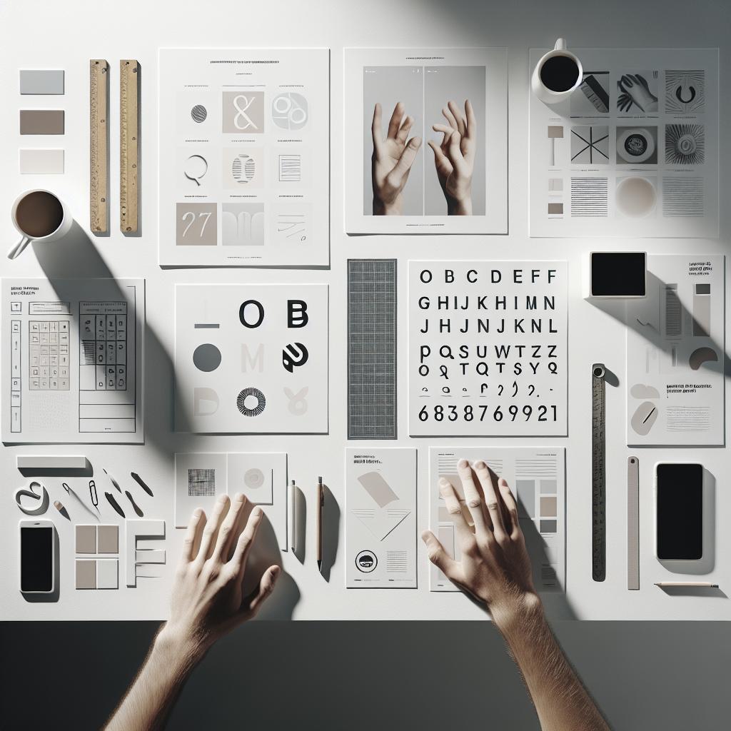
Begin by conceptualizing the theme and focus of your magazine cover. What is the main story or feature? Who is your target audience? Answering these questions will help you define the visual and textual elements that need to be present. Create a mood board with inspiration images, colors, and typography examples to guide your design process.
Step 2: Choose Your Color Palette
Select a color palette that aligns with the overall theme of your magazine. Minimalist designs typically use a monochromatic or limited color scheme. Neutral tones are often favored, but incorporating a single vibrant color can draw attention to key elements. Use color sparingly to maintain a clean and uncluttered look.
Step 3: Select Your Fonts
Choose fonts that reflect the tone and style of your magazine. Sans-serif fonts are common in minimalist design due to their clean and modern appearance. Limit your selection to two fonts to avoid a cluttered look. Play with different weights and sizes to create a visual hierarchy and guide the reader’s eye.
Step 4: Arrange Your Layout Methodically
Design the layout with a keen eye for balance and alignment. Use gridlines to ensure that all elements are precisely placed. The cover should lead the viewer’s eyes in a logical sequence – from the masthead to the main headline and supporting text. Ensure there is sufficient white space around each element to help it stand out.
Step 5: Incorporate Images Purposefully
Select high-quality images that complement your design without overpowering the text. Images should have a clear focal point and ample negative space. If using a background image, ensure it doesn’t clash with the text. Minimalism is about striking a balance – images should contribute to the cover’s story, not clutter it.
Step 6: Finalize Your Text Elements
Develop concise and compelling headlines and cover lines. Use a hierarchical structure to make the main headline the most prominent element. Supporting text should be clear and legible but not distract from the overall design. Pay attention to kerning (spacing between letters) to maintain a polished look.
Step 7: Review and Refine
Step back and review your design. Ensure all elements are aligned and there is a harmonious balance between text, images, and white space. Check for any inconsistencies in style or alignment. Make any necessary adjustments to ensure that each component aligns with the minimalist aesthetic.
Step 8: Export Your Cover
Once satisfied with your design, it’s time to export the cover. Ensure you use high-resolution settings suitable for printing or digital formats. Save your work in various formats (PDF for print or JPEG for web) to ensure it meets the requirements of different platforms.
Minimalist Magazine Cover Design Examples From Envato Elements
Minimalistic Magazine Set
The Minimalistic Magazine Set available on Envato Elements epitomizes the principles discussed in this guide. The set features clean lines, a limited color palette, and strategic use of white space. The typography is modern and sans-serif, and the images used are high quality with ample negative space, creating a balanced and attractive cover.
Minimalist Magazine Cover Design
Another excellent example from Envato Elements is the Minimalist Magazine Cover Design. This template offers flexibility while adhering to minimalist principles. The design employs a limited color scheme with striking typography. The careful placement of elements ensures that the cover remains uncluttered yet impactful, demonstrating how simplicity in design can effectively capture attention.
That’s It!
These steps and examples empower you to create minimalist magazine covers that stand out in an increasingly crowded market. By mastering the art of minimalism, you’ll not only produce aesthetically pleasing designs but also convey your message more effectively. As you embark on your creative journey, remember to balance simplicity with purpose, ensuring that each element adds value to your design. “`html
| Section | Content |
|---|---|
| Introduction | Overview of minimalist magazine design principles and blog post objectives. |
| Tips on How to Create a Minimalist Magazine Cover | Guidelines for selecting color, typography, and images for a minimalist design. |
| What You’ll Learn | Skills and insights gained from the guide, including design principles and tools. |
| What You’ll Need | List of essential tools and resources for designing a minimalist magazine cover. |
| Step-by-Step Design Process | Detailed steps from conceptualization to exporting the final cover design. |
| Design Examples From Envato Elements | Showcase of minimalist magazine cover templates demonstrating the principles discussed. |
“`